A name gives us something to point at. “Make it modern” could mean almost anything. “An editorial layout with a little scrapbook texture” is a direction we can actually discuss. This guide collects 22 styles, places to see them, and our view on when each earns its place.
Start with the job the site needs to do
A visitor buying a ticket needs a clear route to checkout. Someone exploring an artist’s work might welcome a surprise. A person opening a dashboard every morning needs to find the same controls without thinking about them.
That is where we start. The style follows the job, the content, and the audience.
These names describe different things. Swiss design and editorial design help organise information. Bento describes a layout. Glassmorphism and neumorphism describe surfaces. Cyberpunk, Victorian, and Y2K bring a particular visual world. A complete design system goes further: it defines reusable components, spacing, accessibility, and interaction rules.
We can combine them. A Swiss structure can hold bento sections with restrained glass effects. A minimal shop can use bohemian photography. Our starting rule is simple: choose one structural approach and one expressive layer.
The recommendations below are our design judgement, not evidence that a style improves conversion. Examples often blend styles. Labels distinguish business sites, personal projects, demos, templates, and references whose imagery carries more of the aesthetic than their interface. Websites change; this is an October 2026 reference guide.
Every style below includes a screenshot preview. Select an image to open it at full size. Screenshots captured 4 October 2026; designs belong to their respective creators. Demos illustrate a style, while real sites may combine several.
Find a direction
- Soft surfaces: Claymorphism, Glassmorphism, Neumorphism.
- Digital nostalgia: Cybercore, Y2K, Pixel art, Synthwave, Cyberpunk.
- Structure and typography: Bento, Editorial, Swiss, Minimalism, Luxury typography.
- Expressive worlds: Neo-brutalism, Scrapbook, Surrealism, Maximalism, Conceptual sketch.
- Atmosphere and craft: Ethereal, Bohemian, Victorian, Wabi-sabi.
Claymorphism
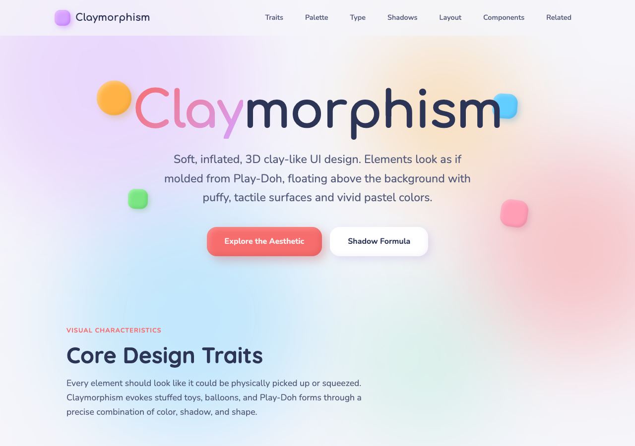
Puffy cards, rounded lettering, soft shadows, and pastel colours.
Open full-size preview →Puffy shapes, rounded cards, and soft shadows give elements the appearance of clay or toys. It can make an unfamiliar product feel friendly.
Where we would use it: learning products, playful consumer apps, and children’s brands. Use it sparingly on dense screens, where inflated cards consume space without necessarily improving understanding.
Explore: GODRICH’s clay landing page — demo collection; Wagner’s clay reference — style demo.
Cybercore
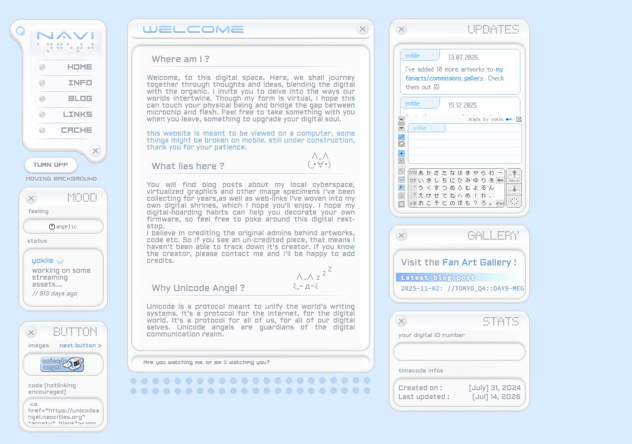
A personal-web interpretation with technical panels and pale digital colours.
Open full-size preview →Chrome, technical graphics, digital machinery, and futuristic interfaces. The term overlaps heavily with the futuristic branch of Y2K; it is not a sharply bounded category.
Where we would use it: electronic musicians, digital artists, experimental fashion, and niche internet communities. It communicates a specific cultural identity more effectively than a generic technology theme.
Explore: Unicode Angel and HEROTRAP — personal sites listed in Neocities’ cybercore collection.
Neo-Brutalism
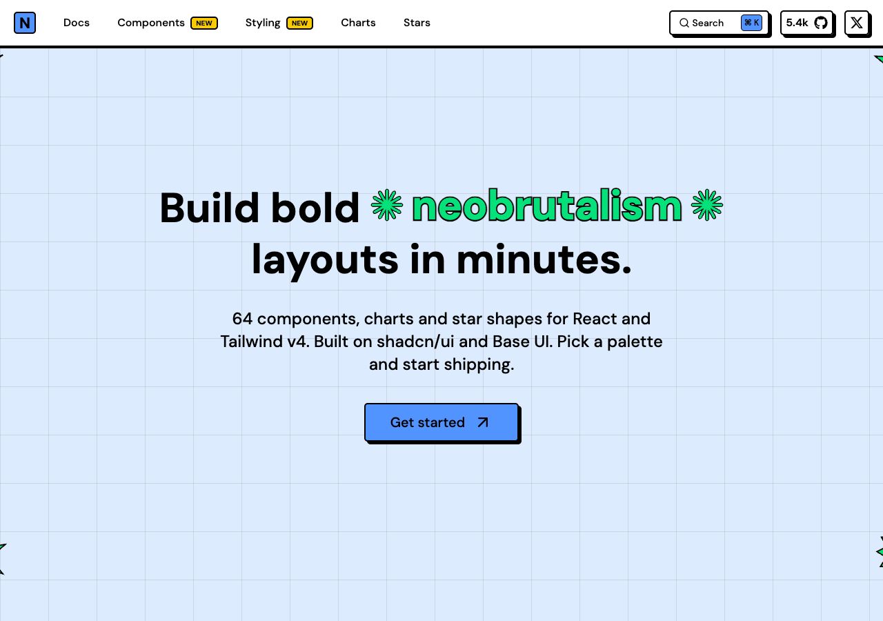
Thick outlines, flat fills, and hard shadows.
Open full-size preview →Thick outlines, hard offset shadows, flat bright colours, and assertive typography. Elements feel distinct and deliberately graphic.
Where we would use it: creator tools, indie products, youth brands, and events. It gives a small brand a recognisable attitude. Strong outlines help separate controls, but colour choices and focus states still need care.
Explore: Neobrutalism.dev — component showcase; Feastables — consumer brand reference.
Scrapbook
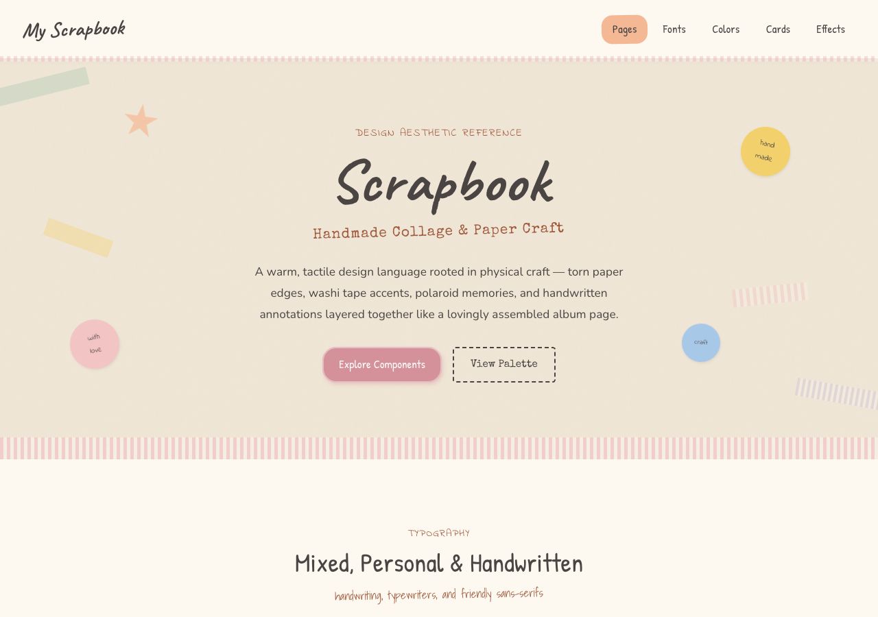
Paper colours, tape, handwriting, and layered details.
Open full-size preview →Paper layers, cutouts, stickers, handwritten notes, and casually arranged photographs suggest an album assembled by a person.
Where we would use it: weddings, personal portfolios, travel journals, and community stories. The visual language makes memories feel personal. Keep navigation more orderly than the decoration.
Explore: Plank’s Scrapbook — interactive conference project; Scrapbook reference — style demo.
Surrealism
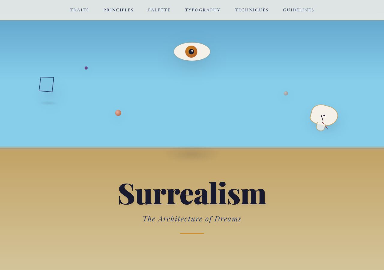
Dreamlike composition and unexpected visual combinations.
Open full-size preview →Impossible scenes, unexpected combinations, dreamlike scale, and imagery that makes us look twice.
Where we would use it: fashion, fragrance, art, creative studios, and product launches. It can express an emotion that a product photograph cannot. Keep the practical route to enquiries or purchases easy to follow.
Explore: Moooi — product stories and art direction; TOILETPAPER — surreal photographic imagery.
Y2K Aesthetic
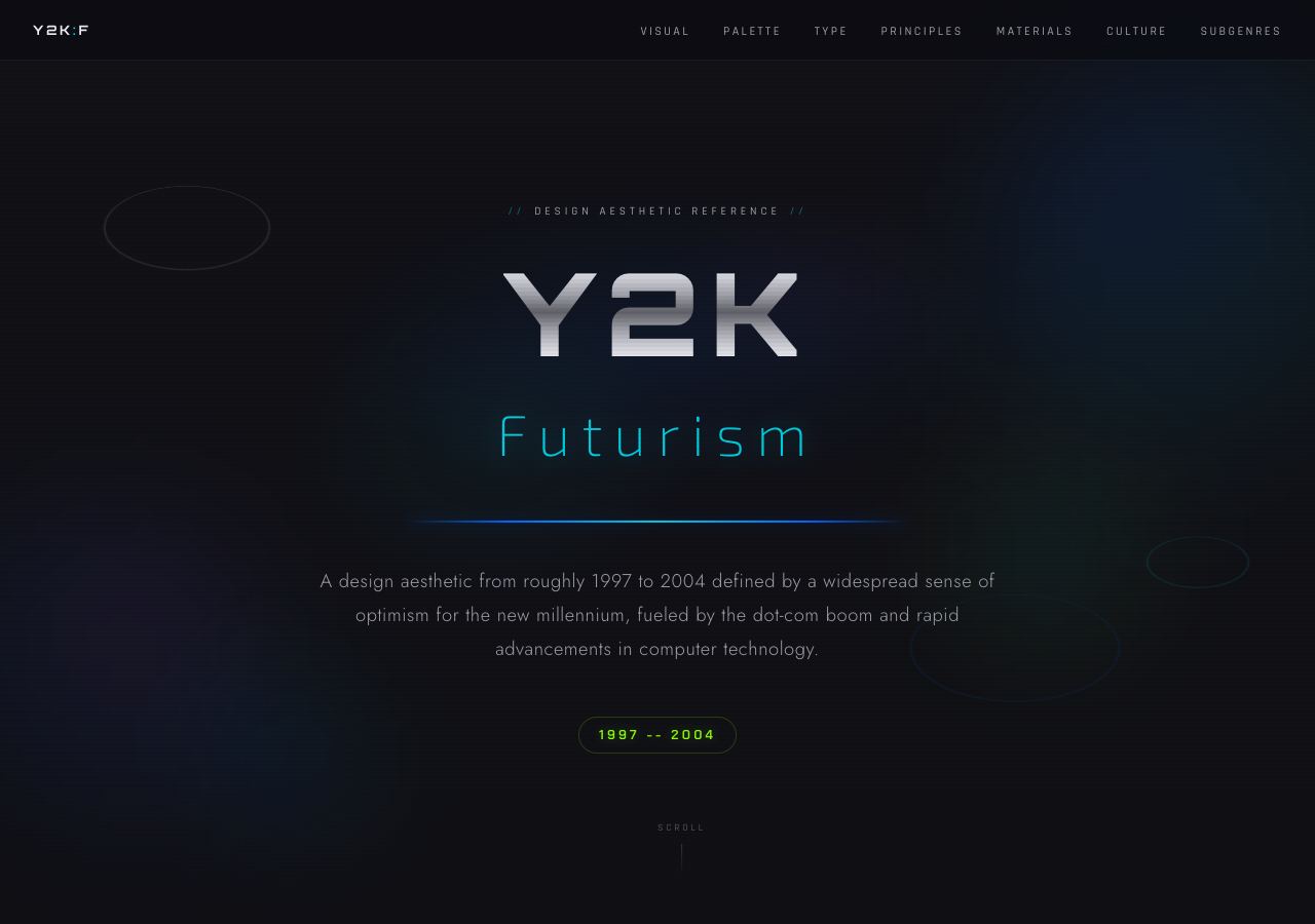
Glossy digital surfaces and early-millennium futurism.
Open full-size preview →Chrome lettering, glossy gradients, sparkles, and early digital nostalgia. The futuristic version sits close to cybercore; other interpretations draw on pop culture and early personal websites.
Where we would use it: streetwear, music, beauty launches, and youth culture. It works when that nostalgia is part of the audience’s world, rather than a decoration added to an unrelated brand.
Explore: PaletteDesk’s Y2K preview — style demo; GODRICH’s Y2K landing sections — demo collection.
Pixel Art
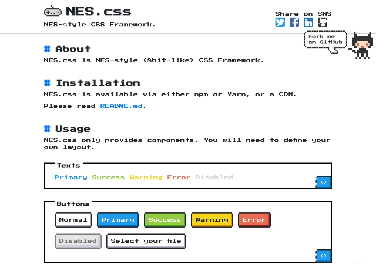
Stepped outlines, pixel lettering, and game-like controls.
Open full-size preview →Visible pixels, sprites, stepped borders, and game-like lettering bring the vocabulary of early digital games into a page.
Where we would use it: indie games, gaming communities, and playful developer portfolios. It suggests exploration immediately. Use a readable text face for longer passages.
Explore: Habbo — pixel-art world and branding; NES.css — interactive component demo.
Synthwave
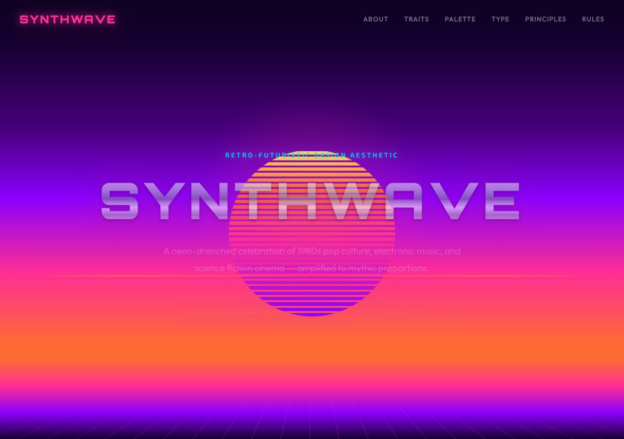
Neon sunset, chrome lettering, and a perspective grid. Notice the low text contrast too.
Open full-size preview →Neon pink and purple, glowing grids, sunset gradients, and an imagined 1980s future.
Where we would use it: electronic music, arcade games, nightlife, and retro events. It establishes a strong mood quickly. That strength becomes a limitation when the brand has no connection to the reference.
Explore: Retro Racer — Webflow project with a live-site link; Synthwave reference — style demo.
Glassmorphism
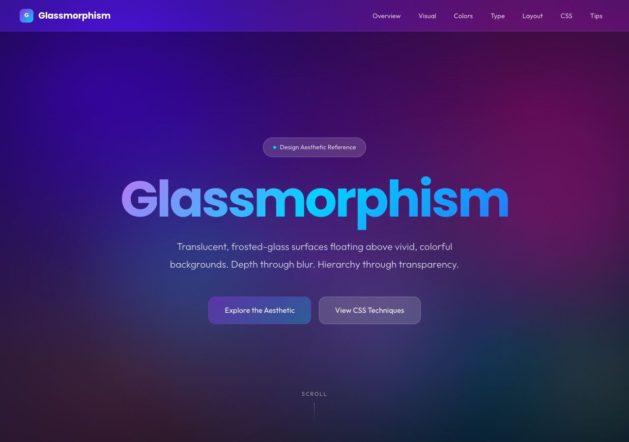
Translucent panels and layered backgrounds.
Open full-size preview →Translucent panels, background blur, thin borders, and layered depth. The background remains part of the composition through the interface.
Where we would use it: technology landing pages, media interfaces, and floating navigation. It can establish layers without covering the whole scene. Check text against every background it crosses.
Explore: Glassmorphism generator — interactive tool; One Page Love’s glass collection — gallery of website examples.
Neumorphism
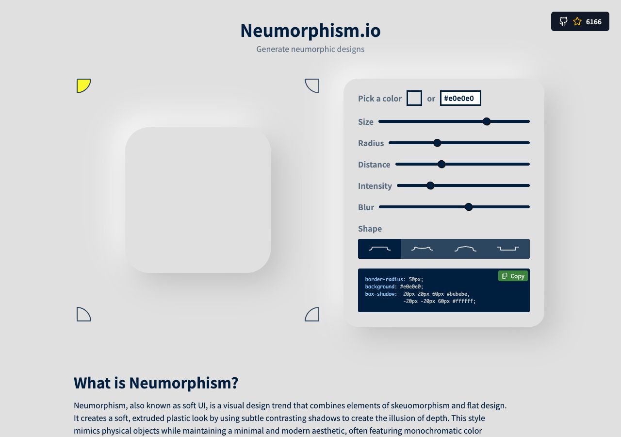
Highlights and shadows lift shapes from one continuous surface.
Open full-size preview →Controls appear raised from, or pressed into, one continuous surface. Light and shadow do most of the work.
Where we would use it: a small audio control panel or focused widget. It can suggest physical hardware. We would be cautious about using it across a large app because boundaries, disabled states, and selected states can become hard to distinguish.
Explore: Neumorphism.io — interactive generator; Remember Style’s neumorphism — interactive style demo.
Bento Grid
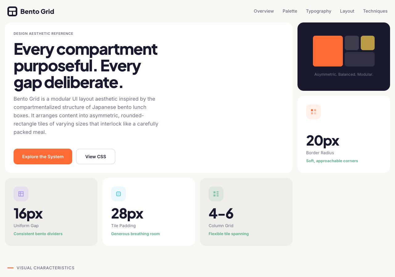
Different-sized cards divide the composition into separate ideas.
Open full-size preview →Differently sized rectangular cards organise content into a modular composition. Bento is a layout technique, so it can carry many different aesthetics.
Where we would use it: feature overviews, SaaS homepages, portfolios, and summary dashboards. Each card can hold one idea. Give more space to more important information rather than sizing cards only to complete a pattern.
Explore: Apple’s Mac mini page — feature groupings; Linear — modular product sections.
Editorial Design
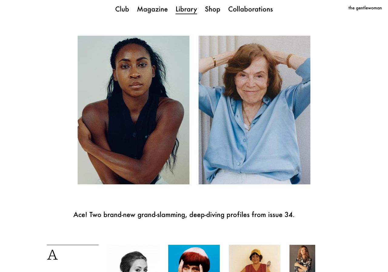
Typography and photography establish the reading hierarchy.
Open full-size preview →Magazine-like hierarchy, strong headlines, purposeful image placement, and a rhythm between short and long passages.
Where we would use it: publications, essays, case studies, culture sites, and brand stories. It accommodates both the reader scanning the page and the reader settling into it.
Explore: The Gentlewoman and It’s Nice That — editorial publications.
Swiss Design
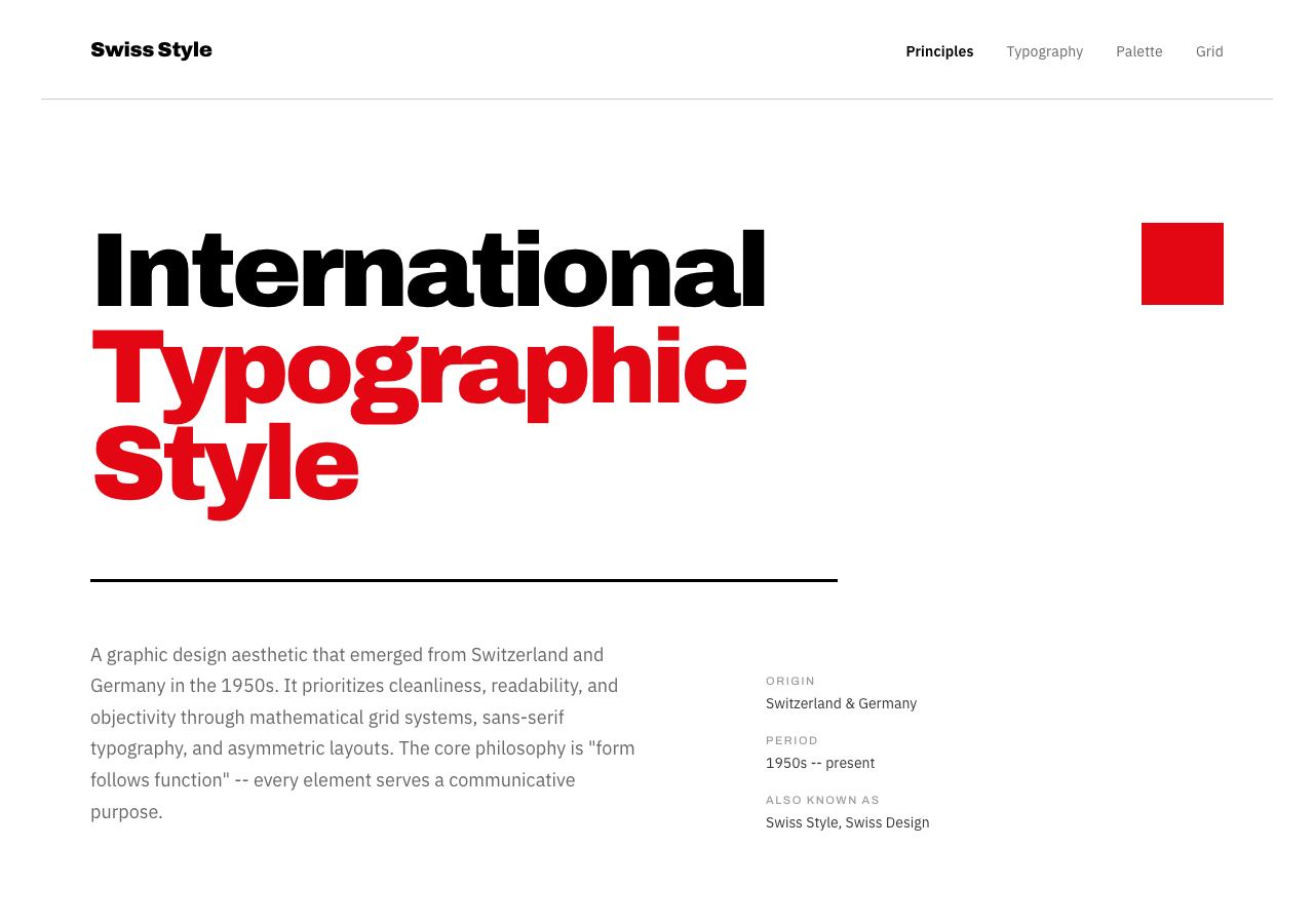
Grid alignment, sans-serif typography, and a clear hierarchy.
Open full-size preview →Precise grids, clear alignment, restrained colour, and strong sans-serif typography make the structure visible.
Where we would use it: architecture studios, institutions, professional portfolios, and information-rich sites. Consistent hierarchy gives complex material a dependable order.
Explore: ECAL — institutional website; Swissted — especially the poster compositions, rather than just the shop interface.
Minimalism
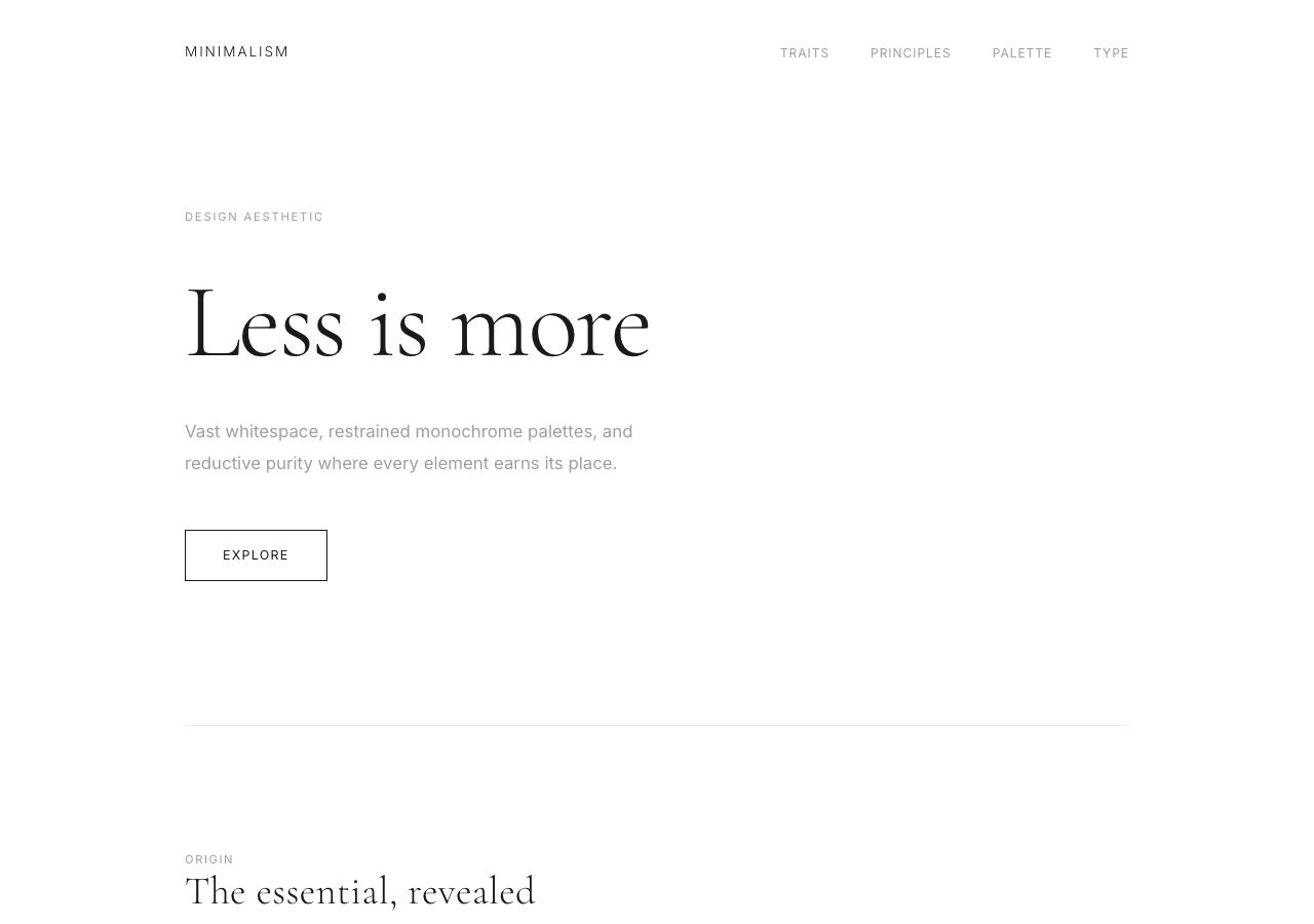
Restrained colour and generous space around the content.
Open full-size preview →Few competing elements, restrained typography and colour, and space around what matters. Minimal does not have to mean empty.
Where we would use it: product shops, photography, professional services, and focused tools. It puts attention on the content. Removing labels or hiding useful controls to make a screen look cleaner defeats the purpose.
Explore: Aesop and MUJI — restrained retail references, with denser catalogue pages where needed.
Maximalism
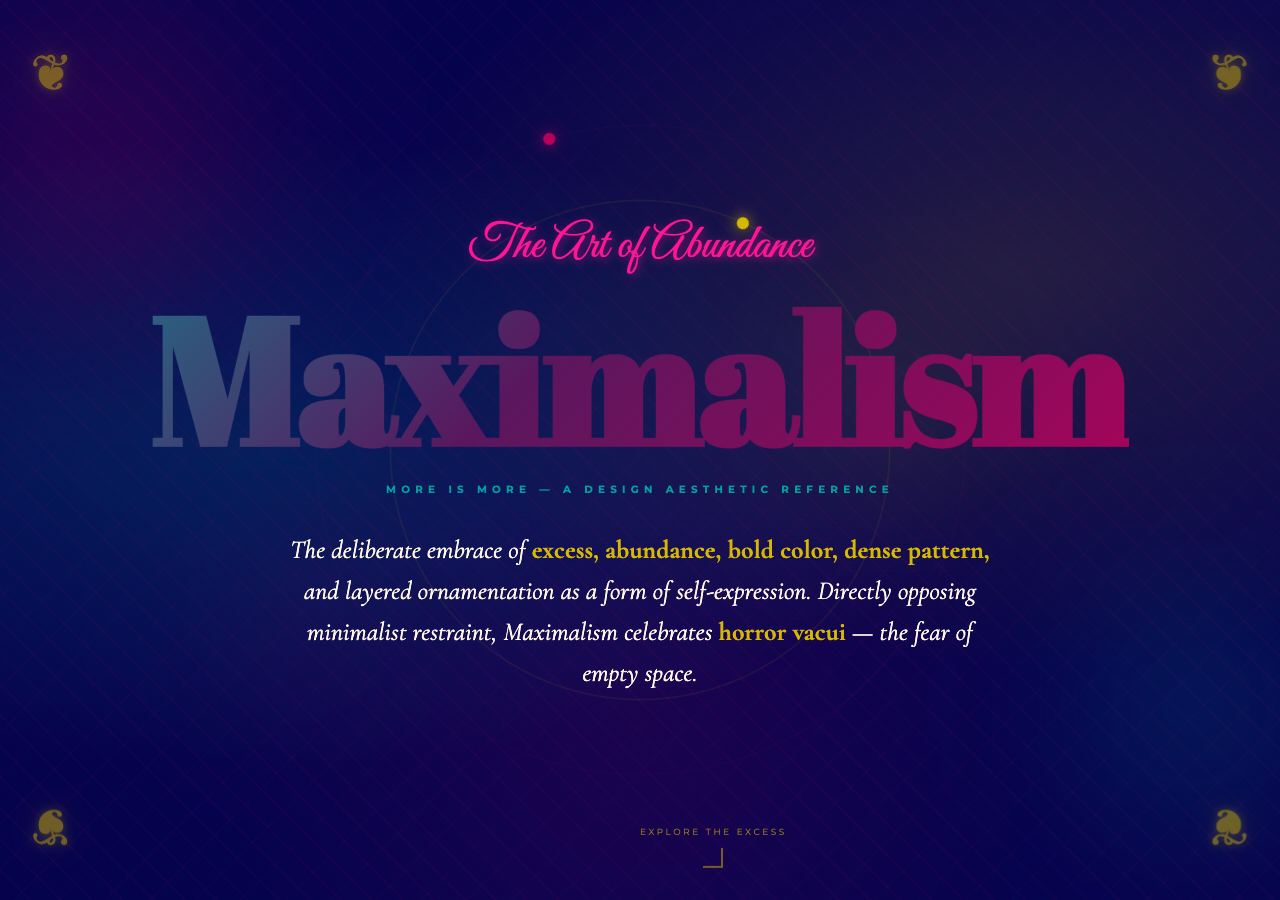
Dense visual layers, expressive type, and abundant colour.
Open full-size preview →Dense compositions, abundant colour, layered imagery, and a willingness to fill the page with personality.
Where we would use it: entertainment, cultural projects, expressive portfolios, and distinctive campaigns. It can create a world worth exploring. The important action still needs a clear place within that world.
Explore: Cameron’s World — an old-web collage; LINGsCARS Museum — the preserved classic site, not the current storefront.
Luxury Typography
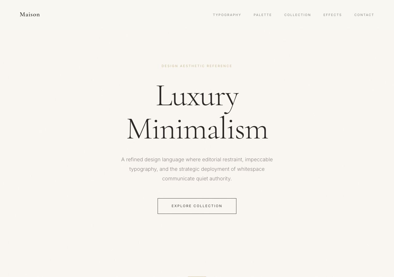
Careful typography and spacing within a restrained luxury composition.
Open full-size preview →Carefully composed display type, elegant proportions, and generous spacing. Expressive serifs are common, but luxury is not a font category.
Where we would use it: jewellery, hotels, fashion, premium property, and fine dining. Pacing and typographic care can suggest craftsmanship. Photography, language, and the actual service must support the impression.
Explore: Dior and Aman — typography within broader luxury identities.
Conceptual Sketch
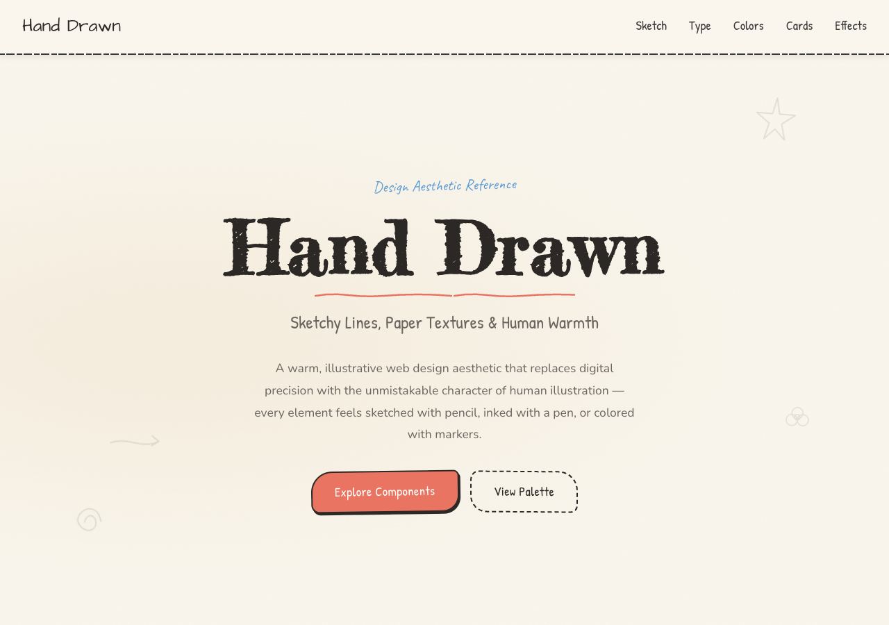
Hand-drawn lines and annotations demonstrate the sketch language.
Open full-size preview →Hand-drawn lines, annotations, diagrams, and the appearance of ideas still being explored.
Where we would use it: workshops, education, brainstorming tools, and portfolios about process. A sketch makes an idea feel open to discussion. Keep controls and instructions unambiguous.
Explore: Excalidraw — canvas and drawing output; Balsamiq — wireframe examples and product previews. These demonstrate the drawing language more than an entirely sketch-styled website.
Ethereal
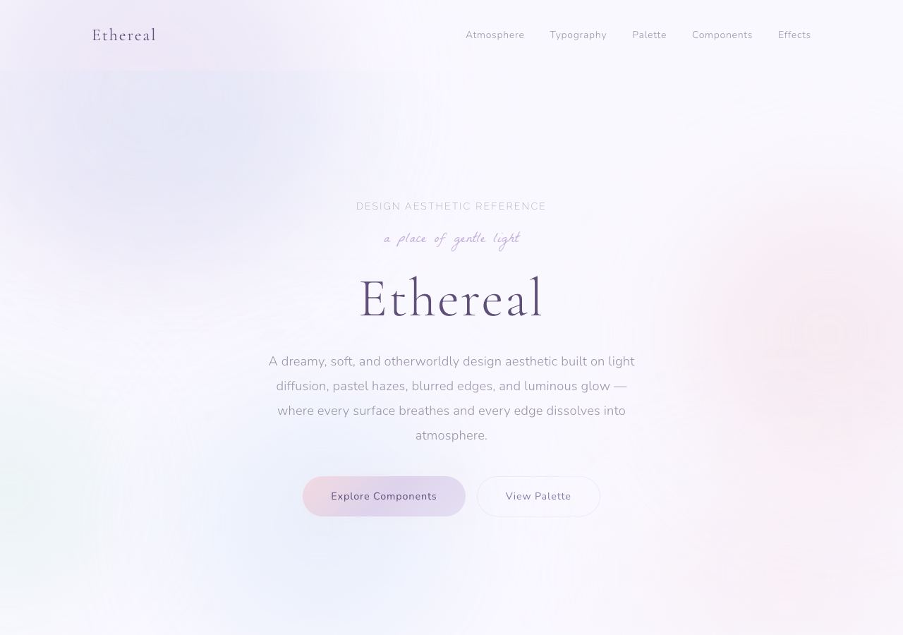
Hazy pastels and diffused light. Pale text needs particular care.
Open full-size preview →Diffused light, hazy pastels, airy spacing, and dreamlike imagery create a soft atmosphere.
Where we would use it: weddings, beauty, meditation, poetry, and ambient music. It encourages a slower, contemplative mood. Delicate visuals still need legible text and visible controls.
Explore: Ethereal reference — style demo; Minted’s Ethereal Display — wedding template.
Bohemian
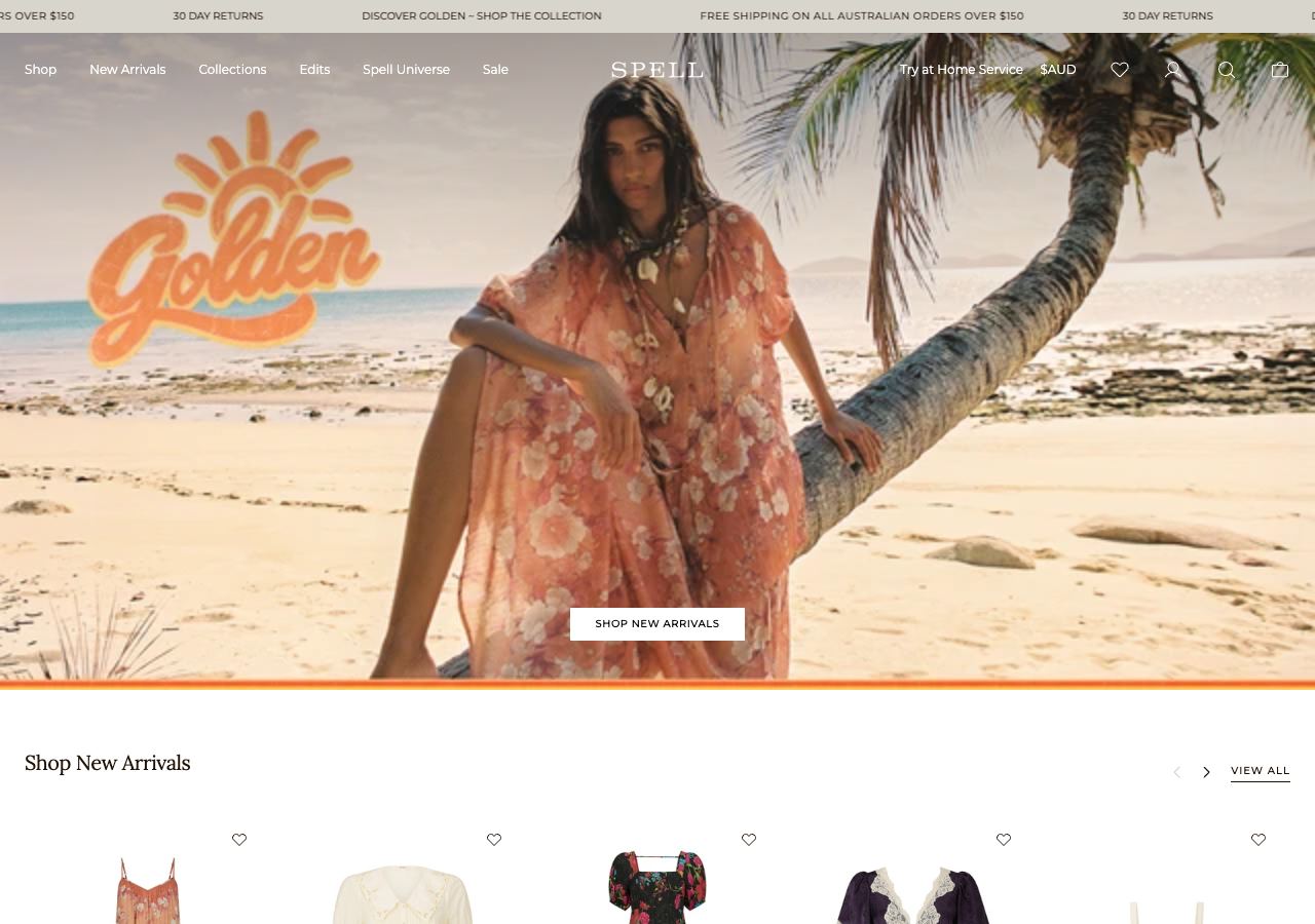
The campaign photography and clothing carry the bohemian aesthetic.
Open full-size preview →Earthy colours, organic patterns, craft references, and relaxed lifestyle photography.
Where we would use it: independent fashion, handmade goods, retreats, and travel brands. It suggests individuality and warmth. A conventional shop interface can work well underneath this art direction.
Explore: Free People and SPELL — especially their campaign photography and styling.
Victorian
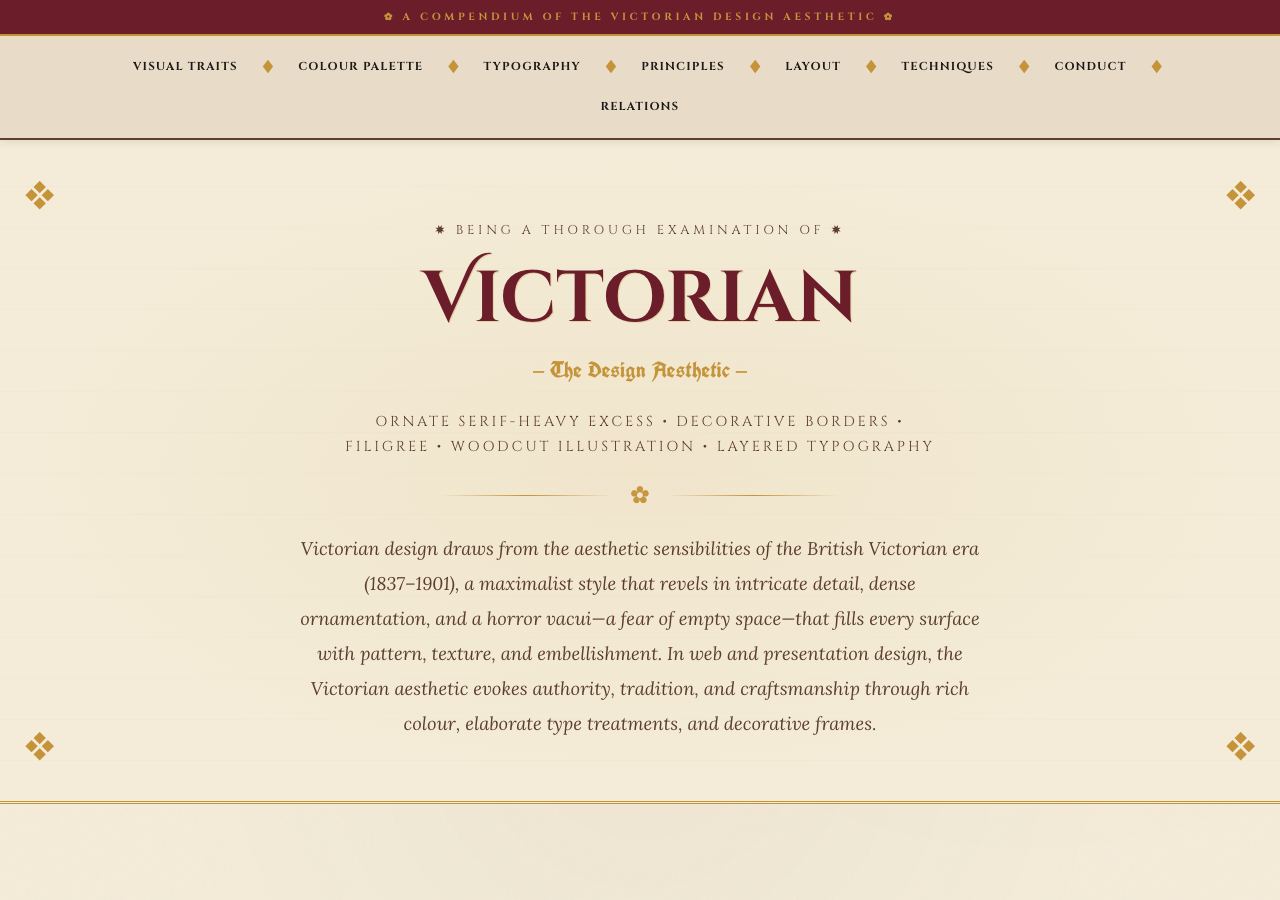
Ornate details, historical lettering, and a paper-like palette.
Open full-size preview →Ornate borders, engraved illustrations, decorative lettering, and historical detail establish a particular period.
Where we would use it: heritage brands, antique shops, theatrical experiences, and historical attractions. It gives provenance and storytelling a visual setting. Save elaborate lettering for short passages.
Explore: Hendrick’s Gin — Victorian-inspired brand world with an age gate; Victorian reference — style demo.
Cyberpunk
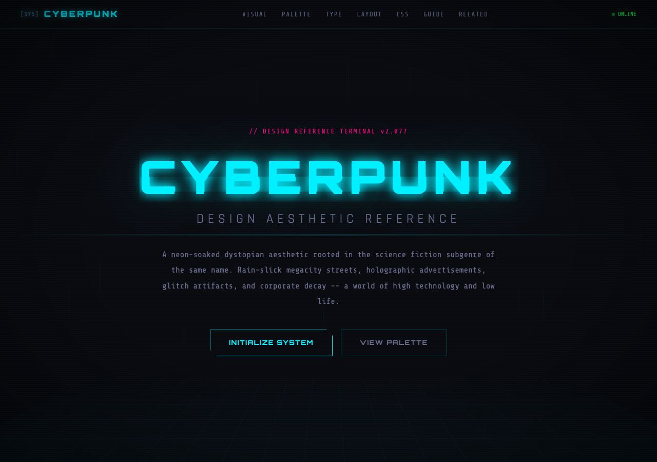
Neon accents and a futuristic interface establish the fictional world.
Open full-size preview →Industrial graphics, neon accents, glitch effects, terminal-like details, and dystopian technology. A dark background alone does not establish the style.
Where we would use it: science-fiction games, esports, entertainment, and immersive campaigns. It builds a fictional world around the content. Keep motion optional and essential information stable.
Explore: Cyberpunk 2077 — official game universe; Arwes — an adjacent futuristic sci-fi UI reference, not a pure cyberpunk specimen.
Wabi-Sabi
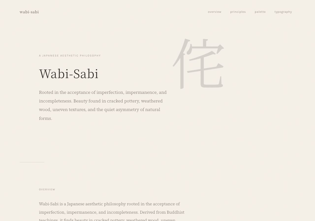
Natural colours, irregular forms, and understated typography suggest material character.
Open full-size preview →Understatement, natural materials, irregularity, patina, and space. It is a broader philosophy; a beige palette alone cannot express it.
Where we would use it: ceramics, artisan goods, interiors, architecture, and quiet hospitality. It draws attention to material character and human craft.
Explore: Beautiful Imperfections — interactive Wabi-Sabi exploration; Axel Vervoordt — related material sensibility and art direction.
Choose by the kind of site
- B2B SaaS: start with a clear grid and selective bento sections. Visitors should understand the product and compare its capabilities.
- Dashboards and internal tools: prioritise conventional components, readable density, and predictable navigation. Repeated use rewards consistency.
- Mainstream ecommerce: keep the interface restrained and use photography and editorial campaign pages to carry the brand. Discovery and checkout should remain easy.
- Luxury hospitality and jewellery: combine typographic care, space, and strong photography. Give materials and craftsmanship room to speak.
- Creative portfolios: use an editorial foundation with one expressive style. The work must remain easy to assess.
- Music, games, and events: select a visual world the audience recognises. Pixel art, synthwave, cyberpunk, or maximalism can fit when they belong to the subject.
- Handmade goods and retreats: consider wabi-sabi, bohemian imagery, or warm minimalism. Let actual materials and places establish credibility.
- Publications and knowledge sites: use editorial hierarchy and Swiss principles to support scanning, reading, and discovery.
- Weddings and personal stories: scrapbook, ethereal, or editorial approaches can give photographs and memories a fitting setting.
More directions worth knowing
The list is open-ended. These are useful additions to a design vocabulary, not a definitive taxonomy.
- Flat design: simple shapes, solid colours, little simulated depth. Useful for everyday applications and services.
- Skeuomorphism: interfaces resemble physical objects. Useful when a familiar instrument or tool makes the interaction easier to understand.
- Bauhaus and geometric modernism: geometry, primary colours, and functional compositions. A direction for cultural events, education, and design studios.
- Art Deco: symmetry, stepped forms, decorative linework, and dramatic lettering. A fit for glamorous hospitality and events.
- Organic and biomorphic design: flowing forms, natural colours, and botanical imagery. Useful for food, nature, and environmental brands.
- Retro print and risograph: ink grain, limited palettes, and imperfect registration. A direction for independent publishing, coffee, and arts organisations.
- Raw web and brutalism: exposed structure and deliberately plain presentation. Distinct from colourful neo-brutalism; useful for experimental publishing and artist sites.
- Kinetic typography: moving type carries the message. Useful for short campaigns and music, with a readable reduced-motion version.
- Immersive 3D: spatial scenes and interactive objects. Useful when exploring the product or world is part of the point.
- Data-first design: charts, tables, filters, and information hierarchy lead. Useful for research, analytics, operations, and monitoring.
Turn a reference into a brief
Pick two or three references and name what matters in each: the grid, the photography, the typography, or the interaction. “We like this site” leaves too much unsaid.
Then write a concrete direction: “An editorial portfolio with large project photographs and a few handwritten process notes.” Build one representative page and test it with real content, a narrow screen, keyboard navigation, and reduced motion. The direction should still work after the impressive opening screen.